Fashion in its most fundamental sense, is all around us. It’s there when we wake up and there when we go to sleep. It’s everything from your grandad styling his Crocs with socks to your sister and her bags full of high street fast-fashion. It’s that $3000 designer bag and those R50 thrifted jeans. As we collectively, yet separately find ourselves predominantly confined within the space of our homes—most likely prancing around in joggers or pyjamas all day—it’s easy to forget just how powerful a tool for self-expression fashion can be. It’s easy to forget at the end of the day that fashion at its core; is a form of artistic expression. Therefore, it also becomes important to remember that art need not always concern itself with matters of material functionality. There has and always will be room for designers to express themselves in a way that leans far more towards the avant-garde, favouring form over function. It is precisely this design philosophy that informs the creative direction and jaw-dropping designs of Swiss/Slovenian designer Ania Marincek. By her own admission the designer says, ”I’m not interested in wearable garments, I wanted showpieces, a strong identity with a textile experimentation focus and creating something that would be different, unique and easily recognisable”.
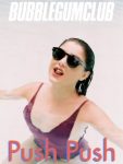
Photograph by Natasha Killeen
Now, at face value this may sound like a pretty odd statement. “Aren’t clothes meant to be worn?” I can just about hear you ask. And the simple answer is—well, yes of course. In the context of daily life clothes play an utterly essential role, however, as mentioned above they may also function as a piece of art. A moveable, moving and flowing art piece if you like. It is here that I’d like to touch on a quote by the legendary founder of the often avant-garde Comme des Garçons, Rei Kawakubo, “I don’t feel too excited about fashion today. People just want cheap fast clothes and are happy to look like everyone else”. A rather harsh but still true statement, which I feel many a fashion aficionados especially within the South African context have experienced. Whether it be interest drummed up by hype or trend focussed fashion, we are all acutely aware that high street will blast us with their eerily similar “interpretations” up until the new trend comes along. I’m excited to report that Ania Marincek leans far more into the work of Kawakubo than her words. One need not look much further than the meticulous detail that goes into each design element of each garment and silhouette to realise that. It’s been a long time since a collection has completely and utterly gripped me—demanding my absolute attention, however, with that said just one glance at Ania’s collection Tears of Lava intrigued me beyond return.
Photograph by Natasha Killeen
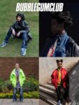
One rarely sees such bold design choices from established fashion houses, let alone as a showcase collection of a bachelor’s degree fashion student. Often at this age, a designer’s aesthetic ethos and design philosophy may still be developing or may be in that limbo phase where they can identify great work but might not have the ability to make it themselves To my eye at least, Ania’s collection falls outside these parameters, possibly due to the wealth of experience she has already built up at the age of 25. While she was formally educated at HEAD in Geneva, she points to interning experiences at high profile brands Faustine Steinmetz and Area NYC as difficult but absolutely crucial learning experiences.
Those two experiences were pretty intense, sometimes really hard but mostly rewarding. Interning is tough but made me learn much more than [I did during] my studies. It helped me gain more confidence in my work, I learned new techniques, the business side of design and I had the chance to meet wonderful people. It is funny because I do feel like those brands and my experiences there influenced my work. At Faustine Steinmetz, I discovered and developed a great interest in textile experimentation. I haven’t used the same techniques I learned there thus far, but this clearly has inspired me to focus my work on fabric manipulation and has since become my favourite part of creation. For AREA, I loved how bold the looks were, the strength of the colours and the extravaganza of some of their looks. The really strong identity of those brands helped me to position myself on what I wanted to bring aesthetically as a designer. I’m not interested in wearable garments, I wanted showpieces, a strong identity with a textile experimentation focus. Creating something that would be different, unique and easily recognisable.
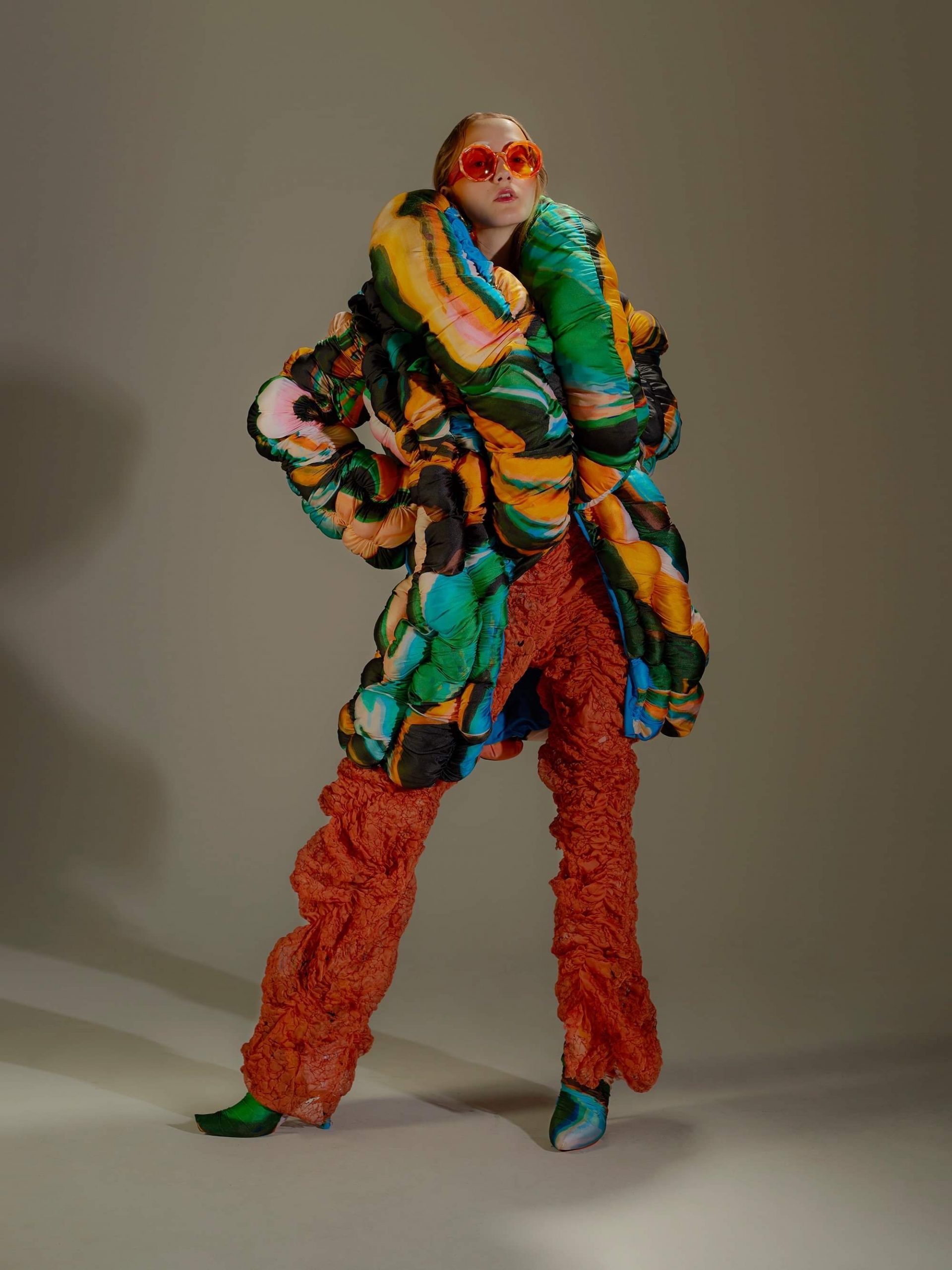
Photograph by Natasha Killeen
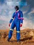
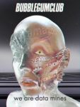
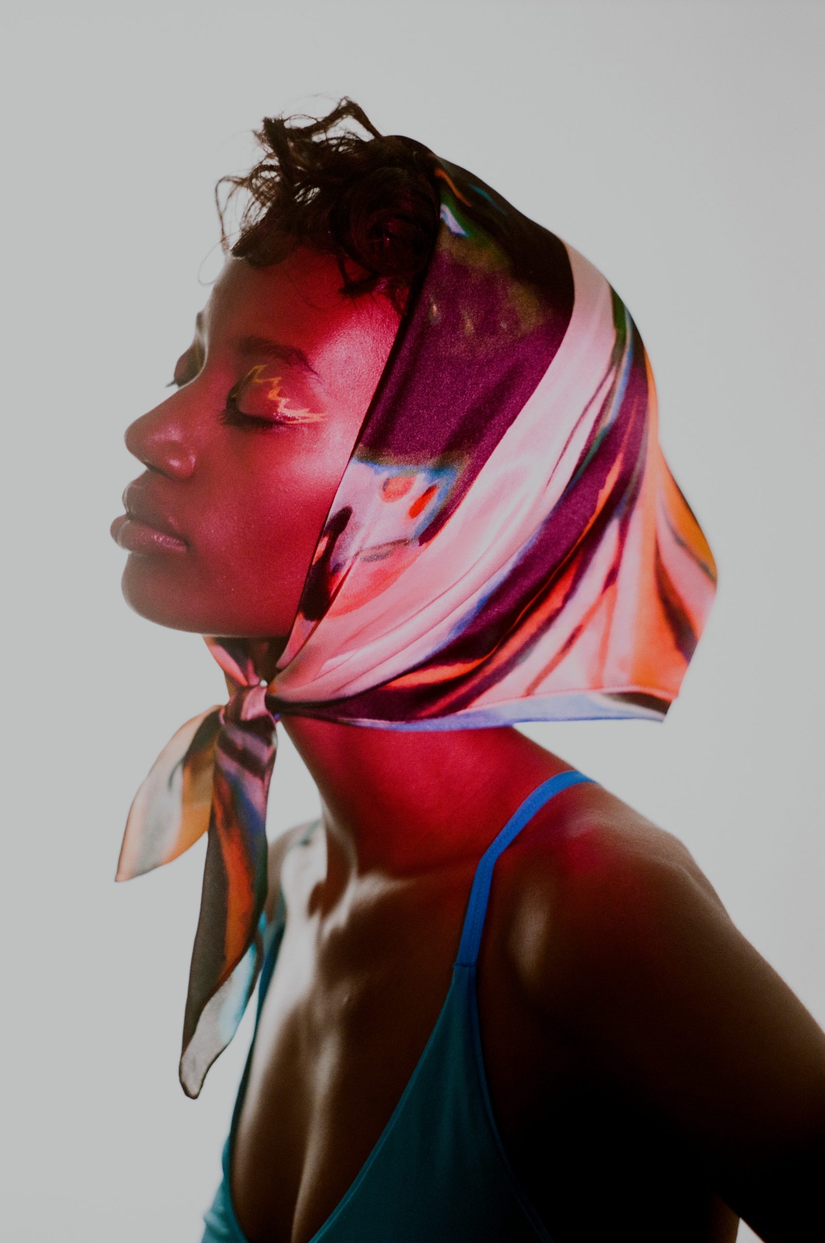
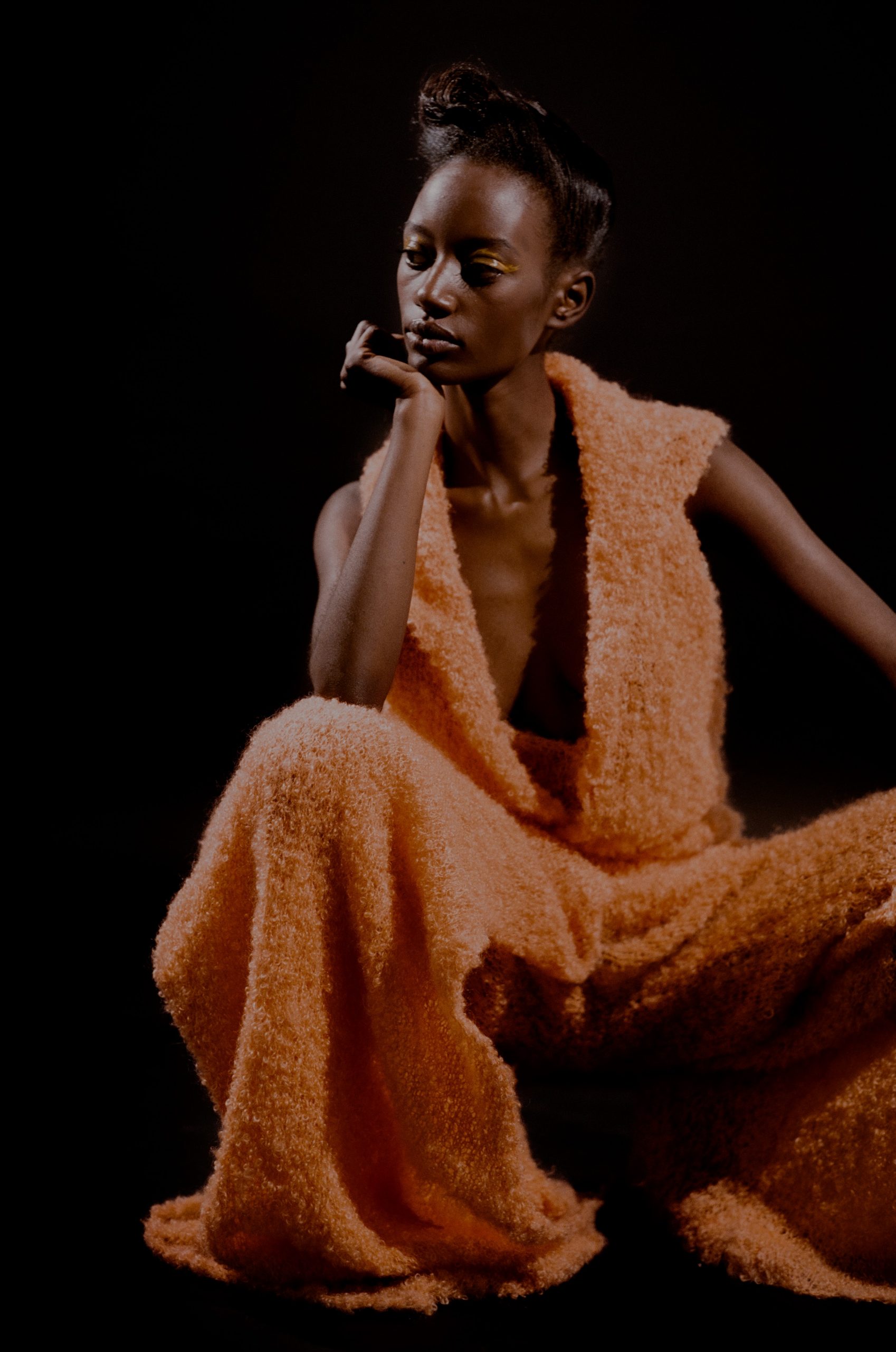
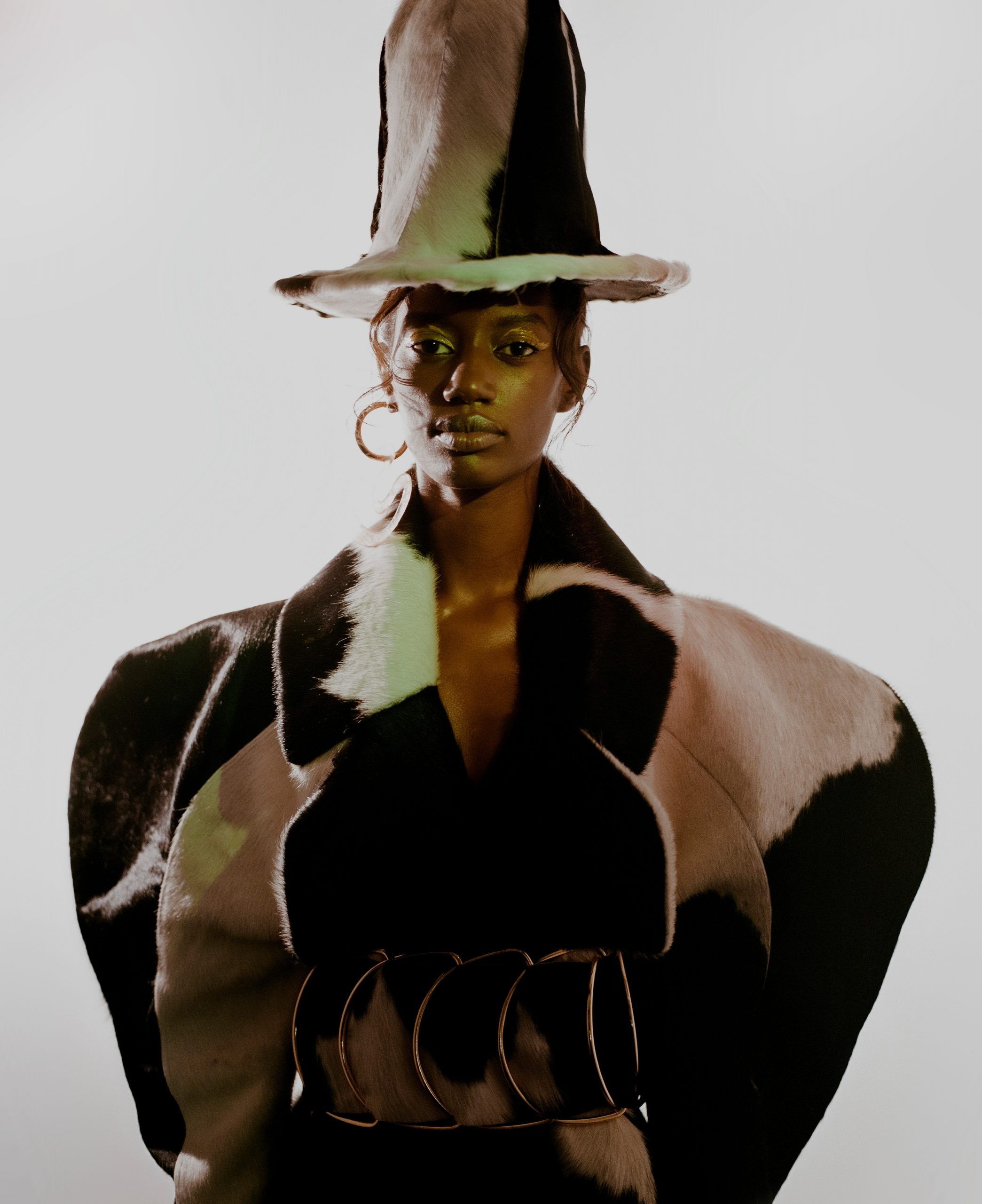
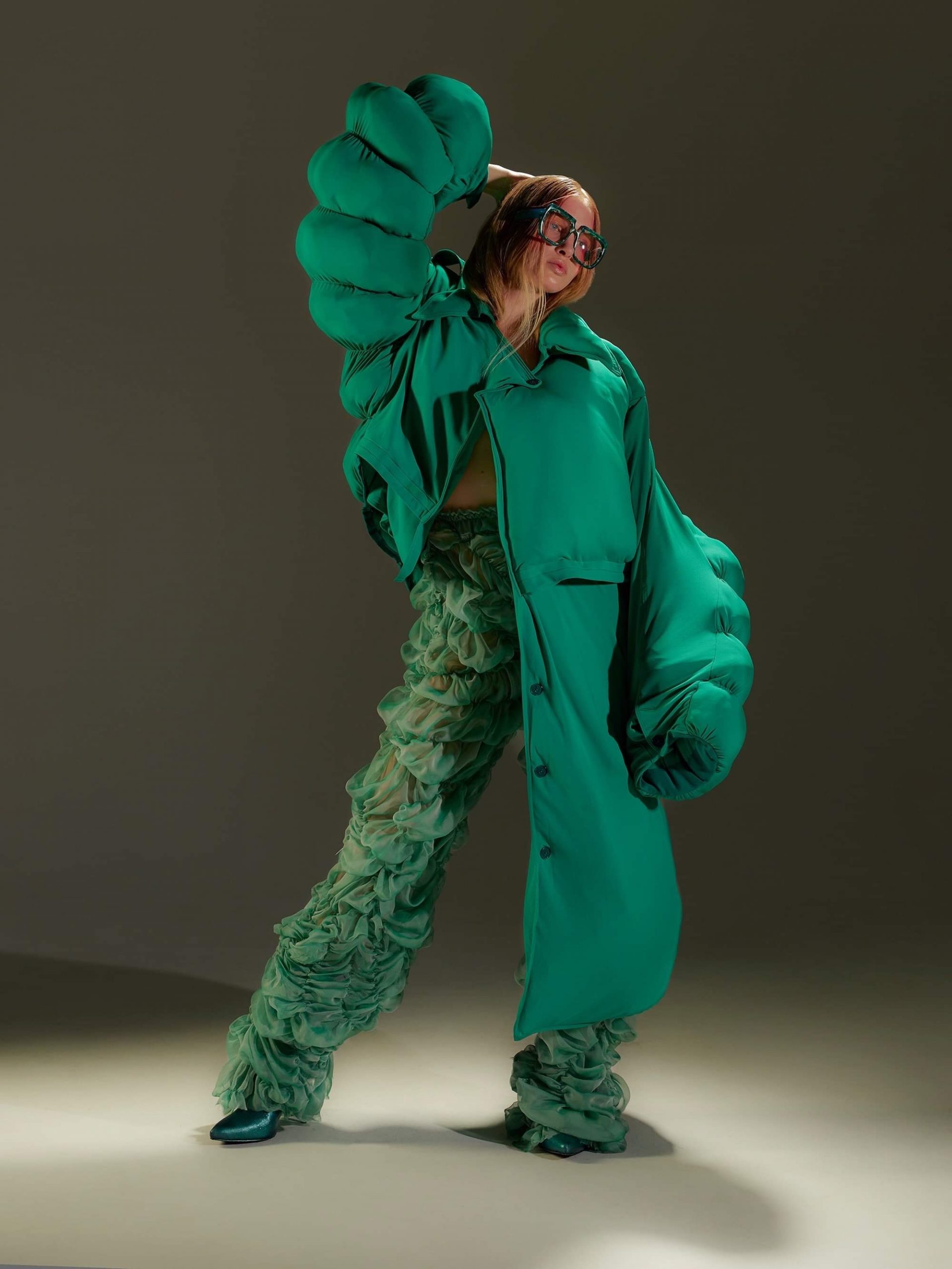
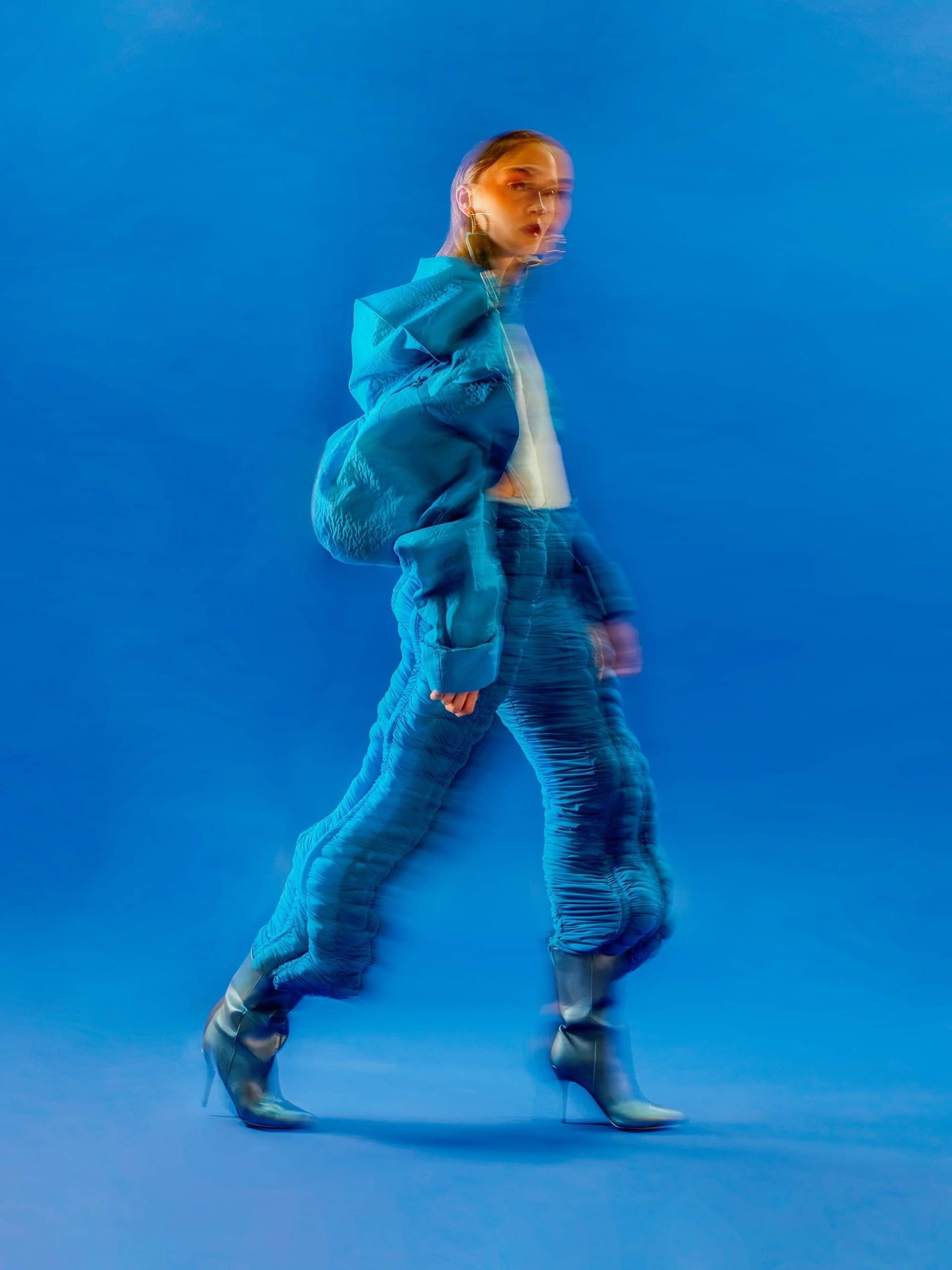
Tears of Lava, is just that. A unique and eye-catching collection that perfectly encapsulates the show-stealing looks Ania aspires to create. In truth, the pieces often take on this sculptural element—contorting proportions. It’s like bubbling, swelling magma, blistered and cooled back to form with a bold colour palette that harks heavily back to the 1970s. Ania points to the fact that she finds inspiration all around her and often in the seemingly mundane,
I tend to amass a lot of images through the day from anything surrounding me. It can be art pieces, things I saw on my IG feed as much as someone in the street or random things such as a decomposing fruit for instance. My starting point for a collection is generally the colour palette, and I can get quite obsessive about it sometimes. It is very important to me to find the perfect fabric, colour and harmony between both. I like to go to the museum and to find the perfect palette directly in a painting, or sometimes it can come from the screenshot of a movie scene for instance.
Photograph by James Bantone
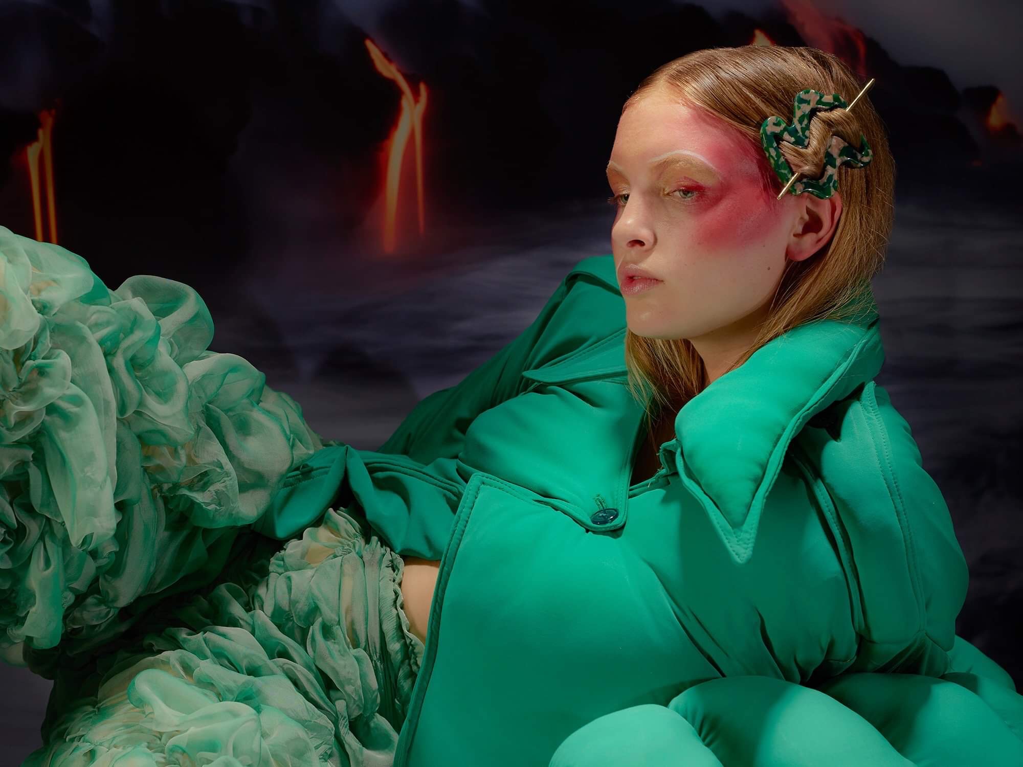
For “Tears of Lava” Ania specifically points to Alejandro Jodorowsky’s 1973 film “The Holy Mountain” as a significant inspiration for the collection. Rather fittingly even the name of the collection has a connection to that of the Jodorowsky family as it’s the title of a song by band Burning Peacocks, that just so happen to be fronted by Jodorowsky’s grand-daughter Alma.
I started the idea of the collection with the idea of skin texture or skin reaction, which would normally spark disgust in mind. Transposed to a luxury fabric with bold colours and it brings the exact opposite feeling and maybe even seduces the onlooker despite its bizarre shape and texture. I had this idea of a burning liquid parasite that would infiltrate under the skin and create reactions on the surface of the skin. I couldn’t put a word on it, but when I read the title, I found that this image of lava as a body fluid was precisely what I was trying to depict in my collection.
Photograph by James Bantone
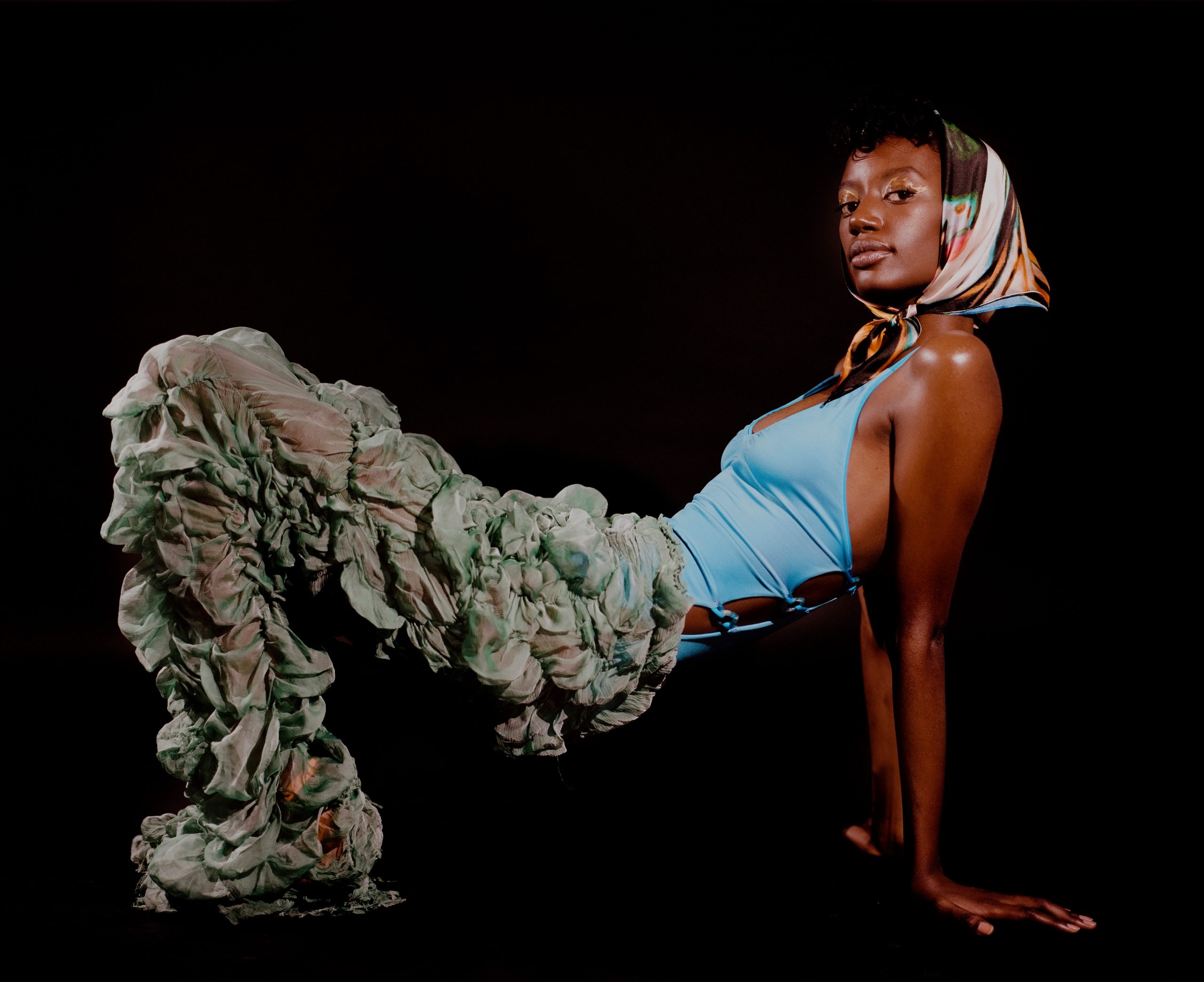
With a stellar debut collection under her name and a continued collaboration with jewellery and accessory designer Julia La Mendola in the works which incorporates more mixed medium work—there’s a lot to get excited about regarding the career of this undeniably talented young designer. Maybe the collection is too bold or too bizarre for your liking, but I’ll end on some more wisdom from the weird and wonderful mind of Kawakubo. “You can tell if it’s a good collection if people are afraid of it. In ten years, everyone will love it”.
Photograph by James Bantone
Photograph by Natasha Killeen
Photograph by James Bantone